What's In a Map?
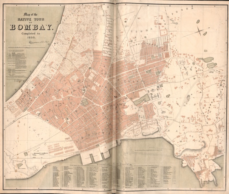
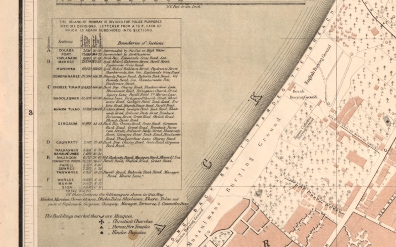
The first thing that intrigues me about this map is its title. “Map of the Native Town of Bombay” sounds like a title that most definitely foreshadows the British influence that went into the creation of this map, because I’m almost sure that Indians didn’t refer to Bombay as a “native town”. During this time, James Andrew Borun-Ramsay was the Governor-General of India and was heading a lot of the industrial efforts that were taking place in Bombay. Most notably, the construction of the first railway came in 1853, which spearheaded a lot of industrialization efforts (Morris 17). The “Railway Terminus” is located at the bottom left of the land mass in the map. The orientation of the map, upon observation, looks just fine. However, it is reasonable to question why the author would position the map with the North facing to the right. The only explanation I could think of would be that it would help for the sake of visualizing the boundaries laid out in the key on the right. As noted, that map is split into six different sections, for police purposes. Those six sections are divided up into even smaller subsections. Interestingly enough, Bombay is also divided up into different neighborhoods, which are titled across the map in large lettering. This is important because if we are inferring that this map was made for government/police purposes, we can be made sure that they knew something of the culture of the area which they were ruling. This being in touch with the culture is what allowed Britain to remain in power for so long.
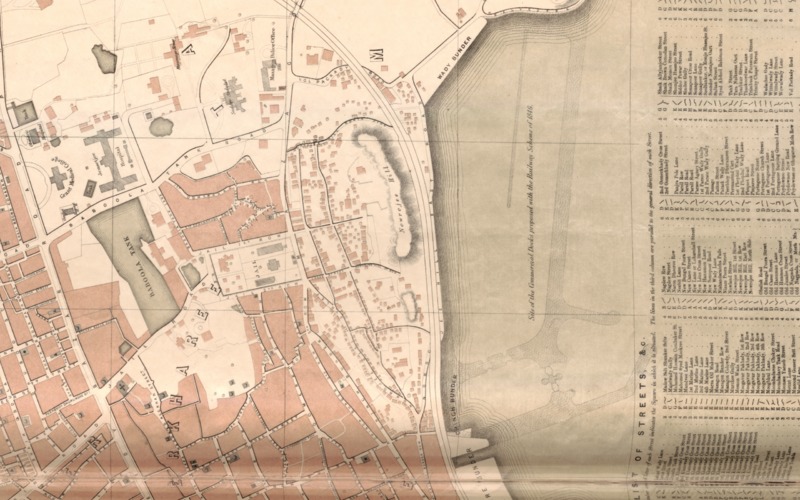
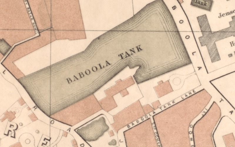
The colors of the map aren’t too emphasized. There are only three main colors used for the sake of distinction and they are: red/pink, green, and grey. First and foremost, all three colors seem to be a little washed and blend in with the overall background of the map itself. Although there is no key that indicates what each color represents, we can be sure that the red, in one way or another, represents commercial areas/buildings across the city. It’s hard to imagine otherwise as those are the only kinds of locations that aren’t mentioned whatsoever on this map. The green is used exclusively in reference to the water tanks that are scattered across Bombay. The grey is used when labeling religious buildings.
One extremely significant part of this map is the labeling of religious structures. There aren’t any other symbols represented on this map besides maybe that of trees. Otherwise, there is a different symbol for each different type of religious building in the city, and each one is located. This is probably where the governing forces probably saw their biggest threat. Throughout history, there have been countless times where religious motivations have fueled uprisings and I could imagine that the British foresaw this threat and made sure to keep each of those location. I think that this map intends to firstly, provide a clean layout of the different sections of the city. However, I do find it odd that the sections which it notes on the key aren’t made more apparent through bordering in the actual cartography. Nonetheless, I believe that this map serves a purpose that probably led to the delegation of certain police forces to specific areas, or at least was a means of keeping an eye on the different parts of the city, given that there is also meticulous data on the population and population densities for each section.
Morris, Morris David. The Emergence of an Industrial Labor Force in India: A Study of the Bombay Cotton Mills, 1854-1947. Berkeley: U of California, 1965. Print.