The Color Orange
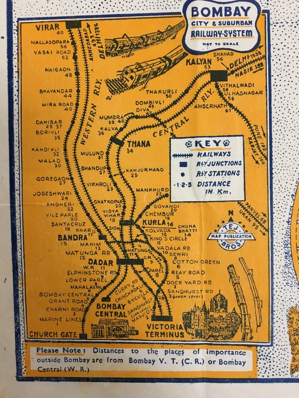
The most striking feature of the map is its bright, orange color. Land is represented by orange space, and all of the additional design elements on the map are black and white. Water is represented by small, blue dots, which are just subtle background to the orange details. Orange is a warm color, giving the map an inviting nature. The bold color is eye-catching, and depicts Bombay as an enthusiastic, friendly place. The key for the map consists of logical symbols that are visually easy to comprehend, including distinct white roads and hash lines for railways.
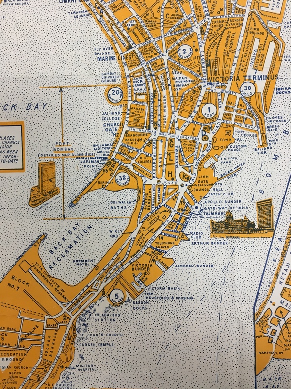
Interestingly, there are numbered circles that represent “post delivery districts”. These distinctions aren’t suggestive of division, but are quite distinctive against the orange land. It’s odd to mark all of the post delivery districts considering that the map’s users, who are likely short-term visitors of the city, wouldn’t have had a need for post delivery. This ambiguity isn’t answered in the map’s booklet, so it’s unclear what purpose they serve in the map. Otherwise, the map is comprehensive in detailing important places and features of the city for tourists. It even provides a note “[ensuring] that all such information has been brought up-to-date at time of publication”, emphasizing the relevance of the map to its time.